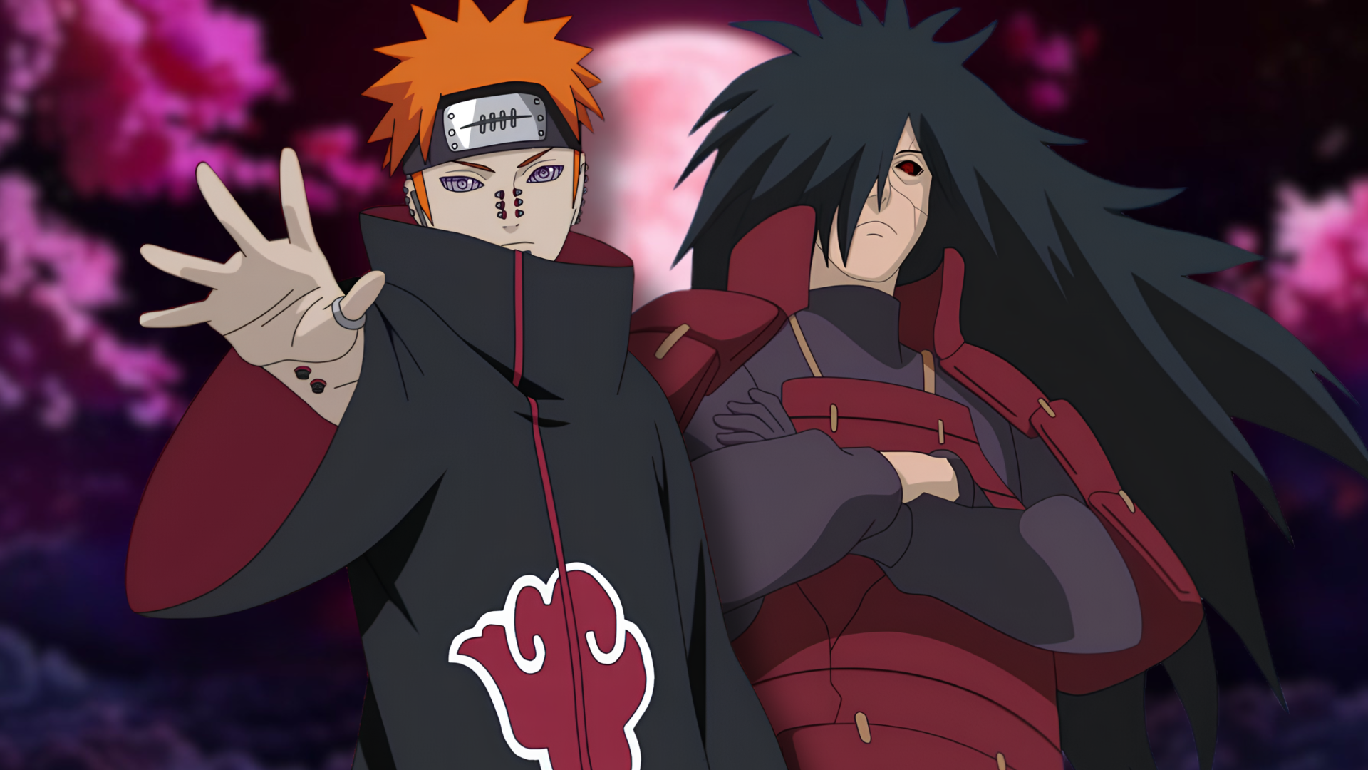
Naruto's villain roster stands out for its visual storytelling prowess. The anime's character designers leverage appearance to communicate ideology, power level, and psychological complexity before antagonists speak a single line.
The series excels at marrying aesthetics with narrative function. Take Itachi Uchiha, whose sleek black cloak, piercing Sharingan eyes, and composed demeanor instantly signal his status as a lethal operator. His design evolution from cold assassin to tragic antihero reinforces the show's thematic exploration of sacrifice and moral ambiguity. Similarly, Madara Uchiha's imposing frame, ornate armor, and regal bearing establish him as an ancient force of nature before his god-tier jutsu abilities become apparent.
Kakuzu's stitched appearance visually represents his obsession with immortality and body modification. Each stitch tells a story of experimental enhancement, making his design inseparable from his character motivation. Pain's multiple piercings and emotionless expression convey otherworldly detachment, while his Rinnegan eyes signal narrative importance the moment audiences see him.
Even secondary antagonists like Obito nail the visual assignment. His masked visage obscures identity while his dimensional abilities justify his partially phased appearance. The design generates mystery that the narrative later exploits.
What makes these designs resonate across the fandom is their functionality. Animation studios Studio Pierrot and later ufotable created silhouettes instantly recognizable during combat sequences. Viewers identify threats through visual language alone, a cornerstone of effective shounen design.
Kishimoto's character conceptualization prioritized visual hierarchy. Villain designs avoid cluttered details that distract from core identity markers. Color palettes remain consistent. Proportions exaggerate personality traits. This restraint elevated Naruto's character design tradition within anime discourse,